
In today’s digital age, having a mobile-friendly website is not just important, it’s essential. With more people using mobile devices to access the internet than ever before, having a website that is optimized for mobile is crucial for success. This post will explore five essential elements of a mobile-friendly website design.
Responsive Design
One of the most important elements of a mobile-friendly website is responsive design. Responsive design means that your website is designed to adjust and adapt to any screen size, whether it’s a desktop, tablet, or smartphone. With responsive design, your website will look great and be easy to use, no matter what device your visitors use.
Fast Load Times
Another important element of a mobile-friendly website is fast load times. Mobile users are often on the go and have limited time, so your website must load quickly. A fast-loading website provides a better user experience and can improve your search engine rankings.
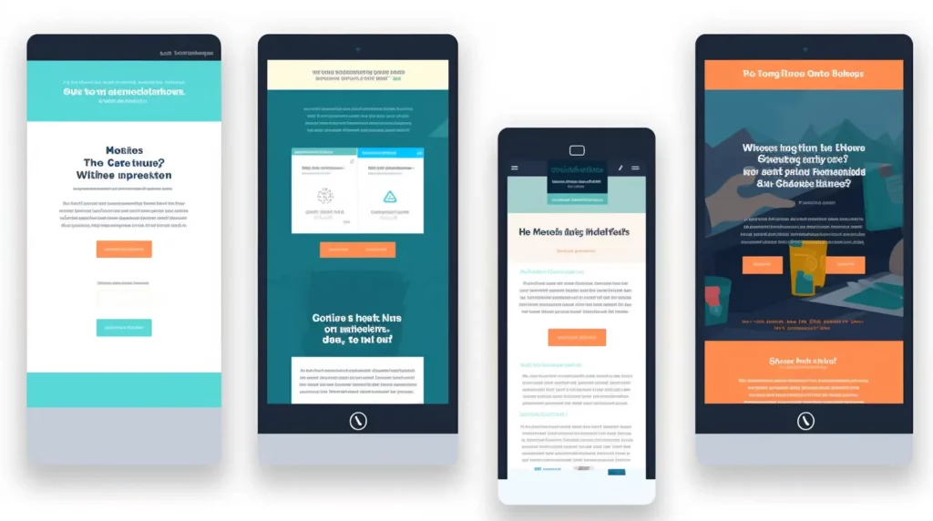
Read this post for 5-key elements to have a website.
Simplified Navigation
Mobile users have a different set of needs than desktop users. When designing a mobile-friendly website, it’s important to remember that users often look for specific information quickly. Simplified navigation is key to providing a positive user experience. Ensure your website’s navigation is clear, concise, and easy to use.
Large Text and Images
Reading on a small screen can be challenging, so ensuring your website’s text and images are large enough to be easily read on a mobile device is important. Use a font size of at least 14px, and make sure your images are optimized for mobile.
Mobile-Friendly Forms
If your website includes forms, such as a contact form or a signup form, it’s important to ensure they are mobile-friendly. Mobile users may be hesitant to fill out forms that are difficult to use on a small screen. Use large, easy-to-use form fields and keep the number of fields to a minimum.

In conclusion, a mobile-friendly website is essential in today’s digital age. By incorporating these five essential elements into your website design, you can provide a better user experience for your mobile visitors and improve your chances of success. Remember to use responsive design, ensure fast load times, simplify navigation, use large text and images, and ensure your forms are mobile-friendly.
All the images of this article have been generated by AI.


Leave a Reply
You must be logged in to post a comment.